Two years ago, National Grid ESO’s Future Energy Scenarios (“FES”) celebrated their 10th birthday. I took a look back at how the scenarios had developed and whether the predictions outlined within them came true as time went on, to whether the FES are useful in practice. My analysis showed that not only did they not come true but metrics often fell at the edges of the entire range of historic predictions. I actually lost interest at that point and didn’t get round to publishing the analysis, but from time to time it gets mentioned, and people have suggested they would like to see it. So here it is…updated for 2022 and 2023.
A brief history of the FES
Since they started in 2011, the FES have taken huge amounts of resource to produce and occupy large amounts of time on the part of market participants, policymakers, the press and other interested parties to digest. But are they actually useful? Do they provide a realistic indication of the future trajectory of the GB energy market?
Last week National Grid ESO published the Future Energy Scenarios for 2023 the twelfth time it had undertaken this annual planning exercise. The complete archive can be found here: FES Archive. Clearly the past 12 years have seen a number of changes at the policy level, notably the legally binding net-zero target of 2050, but as these have been reflected in the FES as they went along, we can see their impact on ESO’s thinking.
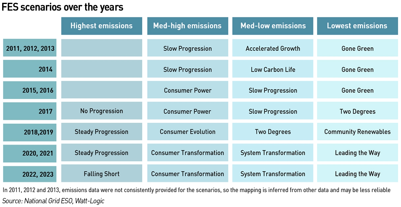
FES-2011 opened with three scenarios:
- Slow Progression: developments in renewable and low carbon energy are comparatively slow, and emissions and renewable targets for 2020 are not met after 2025
- Gone Green: the renewable target for 2020 and the emissions targets for 2020, 2030 and 2050 are all reached
- Accelerated Growth: has the same view of energy demand as Gone Green but has faster development of off-shore generation. All environmental targets are reached, earlier than the required dates
“It is important to remember that these are scenarios, not forecasts…Gone Green represents a balanced approach to meeting environmental targets, with contributions from the heat, transport and electricity generation sectors. It is by no means the only means of reaching the targets, and there is limited cost minimisation in the modelling so there may be cheaper solutions, but it is a scenario which does not require extreme efforts from any one sector in isolation,”
– FES-2011
At the time, UK Government and EU targets required that by 2020 15% of all energy would come from renewable sources, with the Government’s Renewable Energy Strategy lead scenario suggesting that the 15% renewable target could be met by a 30% renewable contribution in the electricity generation market, 12% renewable contribution from heat generation, and 10% renewable contribution from transport. Carbon budgets set by the Committee on Climate Change (“CCC”) and subsequently adopted by the Government, called for carbon emissions to be reduced by 37% compared to 1990 level by 2020 and 60% by 2030.
FES-2013 saw the retirement of the Accelerated Growth scenario with just two scenarios remaining: Slow Progression and Gone Green. The following year, two further scenarios were added: No Progression, where low affordability leads to low sustainability and Low Carbon Life where more money is available due to higher economic growth and de-carbonisation is delivered slowly through purchasing-power and macro policy.
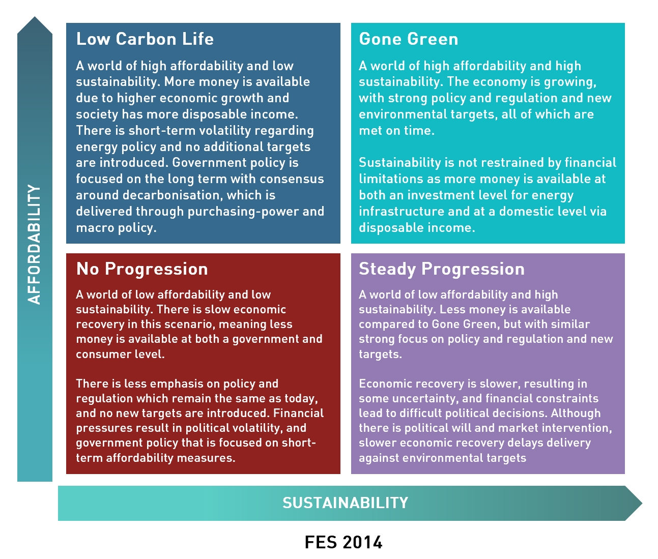
Low Carbon Life was a short-lived scenario, being replaced the following year with Consumer Power, a world of relative wealth, fast paced research and development and spending where innovation is focused on meeting the needs of consumers and improving their quality of life. In 2015 the axes also changed from Affordability and Sustainability to Prosperity and Green Ambition.
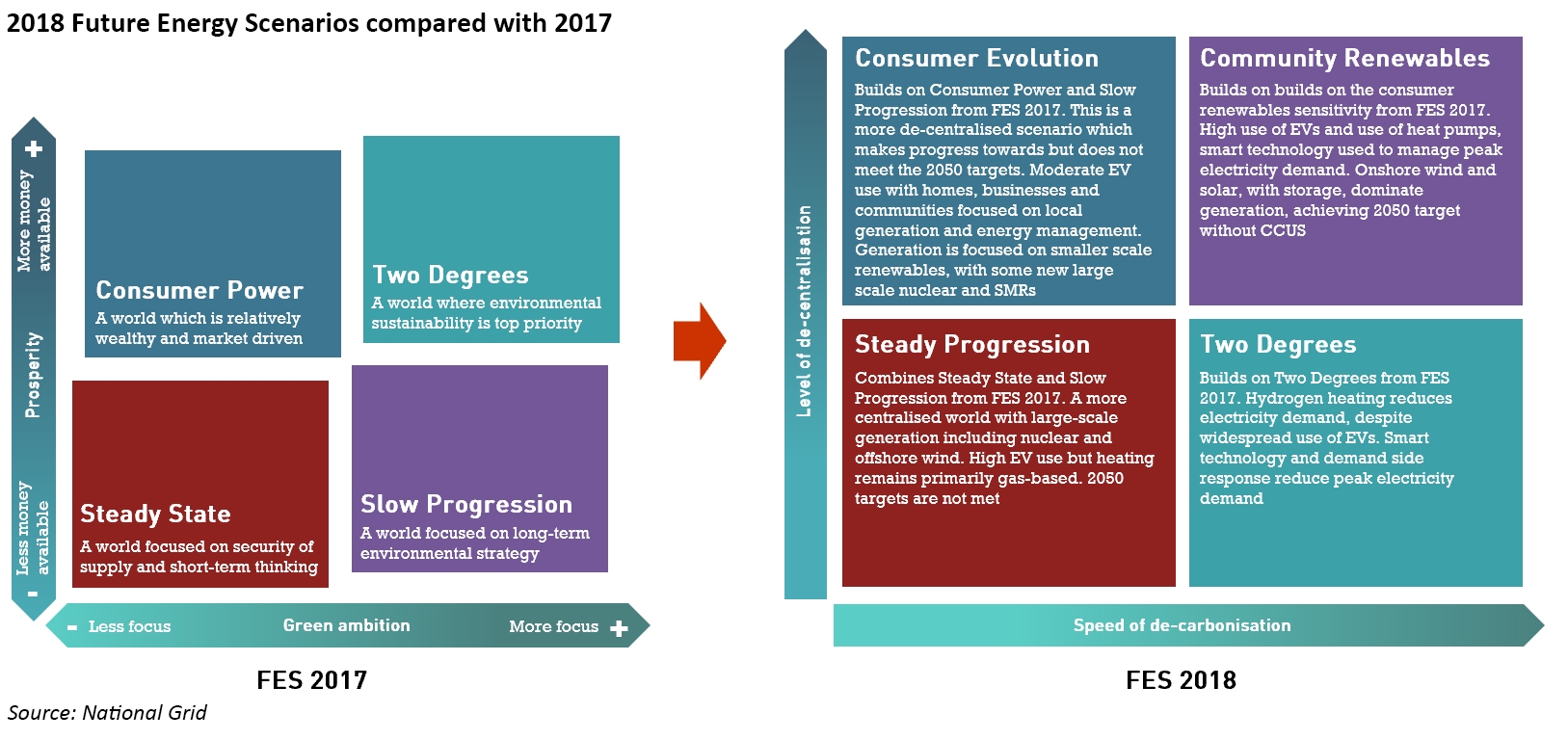
The scenarios changed again in 2018, with Steady Progression replacing No Progression, Consumer Evolution replacing Consumer Power, Community Renewables replacing Gone Green and Two Degrees replacing Slow Progression. The axes also changed to Level of de-centralisation and Level of de-carbonisation.
Two of these scenarios meet the 2050 carbon reducing greenhouse gas emissions by at least 80% from 1990 levels by 2050: Two Degrees, based on centralised and transmission connected technology; and Community Renewables, based on more de-centralised technology.
In 2019, the analysis was adjusted to reflect the change in de-carbonisation policy to a new target of net zero emissions by 2050.
In 2021, the scenarios changed again to more or less their current format. The axes became Level of Societal Change and Level of De-carbonisation, while the historic square matrix has changed to reflect a different relationship between the scenarios as shown below:
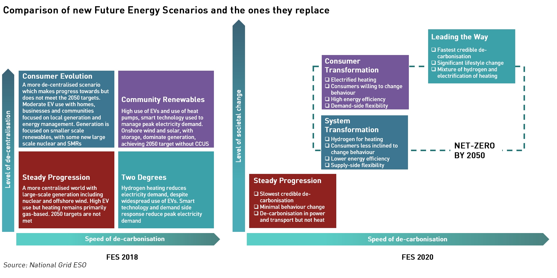
In 2022, Steady Progression was re-named Falling Short to reflect its expected failure to meet net zero targets.
In many ways the change in the axes is more interesting than the changes in the scenarios. When the FES were first introduced, they reflected the energy trilemma, with a focus on affordability and de-carbonisation (termed “sustainability”) – security of supply is assumed to be present in all scenarios.
The de-carbonisation axis has, unsurprisingly, been a feature of all of the scenarios, but on the y-axis, we have seen a move from affordability, to de-centralisation, and now to societal change as the key metrics. In some ways, de-centralisation was something of an outlier here since it was more a result of the transition than a factor in its development, with affordability and degree of societal change being much more appropriate as conditions for success.
The new focus on societal change reflects the realisation that consumers will be at the heart of the energy transition and their willingness to change will depend on a range of factors of which affordability is just one. For example, householders may be able to afford replacing their gas central heating with air-source heat pumps, but be unwilling to do so because of long pay-back periods, the disruption of the works, the likelihood of higher energy bills due to higher electricity prices etc. If something feels like poor value or will be disruptive, consumers will not be inclined to buy it regardless of whether they can afford it.
The chart below shows how these scenarios map to each other in terms of emissions.
The scenarios show a surprising degree of variability
In the 2021-FES webinar, one participant questioned the suitability of the scenarios pointing out that sometimes the scenarios in one year fall outside the range of outcomes from the previous year’s scenarios, suggesting that the difference in the scenarios is too narrow to be credible. This was an interesting point which I was keen to explore further. The metrics that are worth considering (since they have been most consistently reported) are:
- Total system demand for electricity
- ACS peak demand
- Total emissions
In each case I identified the highest and lowest values for 2010, 2020, 2030 and 2050, where provided. The charts lead to a number of interesting conclusions.
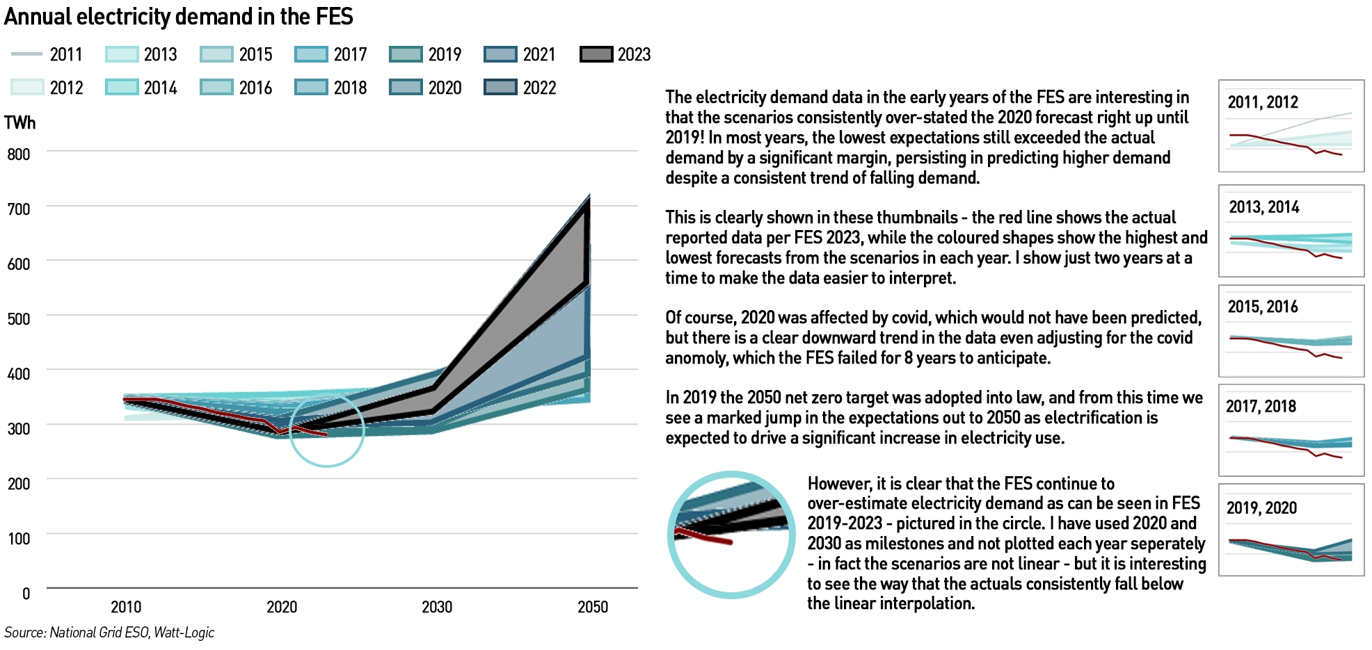
Total electricity demand (referred to differently in the scenarios but now called “GB FES System Demand Total”), has been consistently over-stated in the historic scenarios. It was not until 2019 that the FES came close to correctly forecasting 2020 demand (ie only one year ahead). The scenarios provide data in all years, not just the ones I looked at for the analysis (I had to simplify and this seemed as good a way as any), so it is important to note that we should not simply assume a linear interpolation between 2020 and 2030 for example. The interpolation is consistently above the out-turn, whereas the individual year-on-year scenarios are more mixed. However, the interpolation is instructive of the high level thinking at ESO that a particular trend is expected, and this is a trend which is not supported by the data.
It is also interesting to note that it wasn’t until 2015 that the 2010 demand data were finalised.
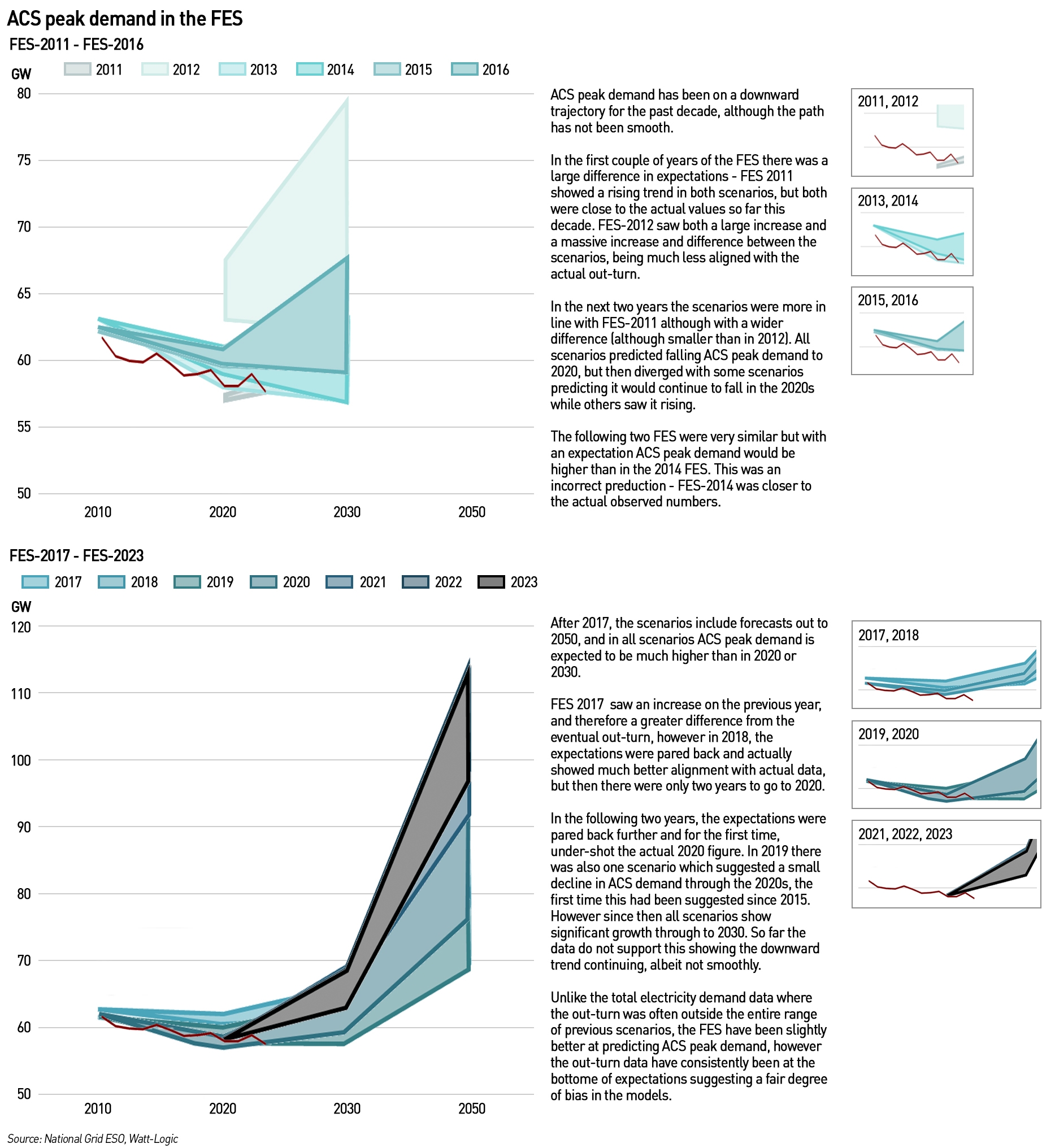
While the ACS peak demand scenarios have been closer to the actual data than was the case for total electricity demand, the actual values have typically been either below those expected in the scenarios, or at the lower end of expectations. The downward trend, while not smooth, has been consistent, but this has largely not been reflected by the scenarios.
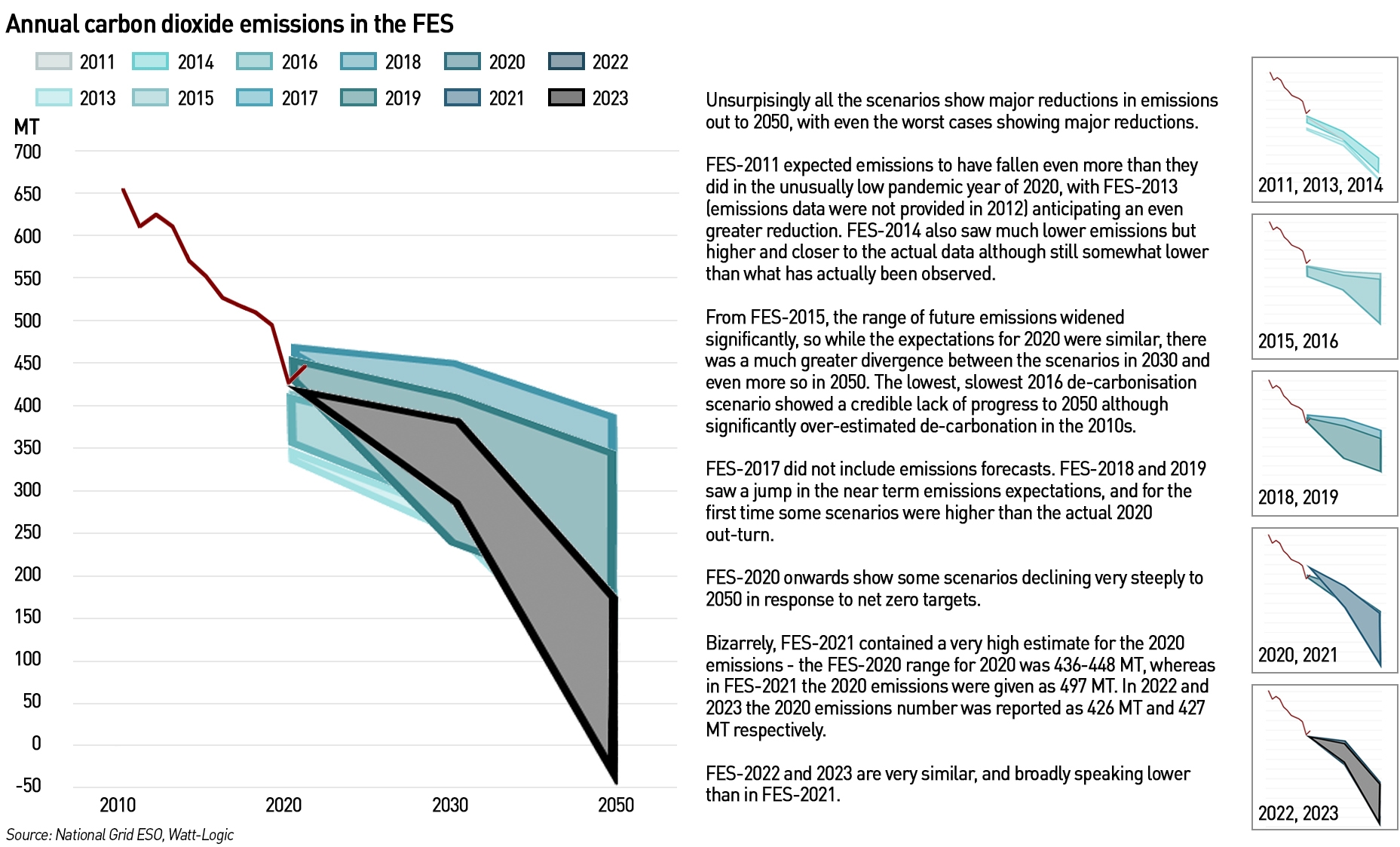
The emissions data in the FES are less complete than for total electricity demand and ACS demand, but there are more data than for other metrics in the FES across the entire history, so I thought it would be interesting to take a look. Total UK emissions have been on a downward trend in the past few decades, driven by a significant de-carbonisation of the power sector (the move away from coal and oil to primarily gas, which pre-dates environmental legislation) and a degree of de-industrialisation in the wider economy.
Until FES-2018, the scenarios predicted this trend would accelerate into the 2020s and beyond, but all scenarios under-estimated actual 2020 emissions. Bizarrely, FES-2021 massively over-stated 2020 emissions, and was higher than prior year forecasts and the historic figure reported in subsequent years. It’s not unusual for historic data to undergo some degree of revision, but it was surprising to see the 2020 data reported in 2021 being substantially higher than both prior year estimates and subsequent actuals. After 2020, the range of 2050 outcomes widened significantly, in response to net zero targets.
“We believe decarbonising energy is possible but also that it will be complex, not least because there are many ways to reach net zero, each with their own trade-offs. Our Future Energy Scenarios (FES) outline four different, credible pathways for the future of energy between now and 2050. Each one considers how much energy we might need and where it could come from,”
– FES-2021
The three most recent FES predict the worst case scenario to see 2050 emissions falling by more than half against 2020 levels but reducing by less than 10% to 2030. In other words, the 2030s and 2040s are expected to deliver significant emissions reductions. This might seem like a safe bet, but it would be useful here as well to show the counterfactual – what would be the trajectory for emissions without the policy changes expected to drive reductions in the 2030s.
A major driver of this reduction is likely to be from the transport sector. Across the FES this year there is a minimal change in the numbers of cars on the roads in 2030 (in fact all scenarios show a small increase), however, in 2050, Leading the Way assumes a 35% reduction in vehicle ownership. As there is only a small increase (17%) in bus numbers, the fundamental conclusion is that mobility itself will decline – in order to meet emissions targets we will need to travel less. Two scenarios assume this will not happen – which seems realistic to me, I think it unlikely that the public would be willing to reduce the amount they travel, particularly when measured after 2030 rather than after 2020 when the pandemic changed mobility patterns.
It’s hard to convert the car ownership numbers into miles travelled numbers as I cannot see those in the workbook (if I’ve missed them, please let me know). It obviously takes time for changes in travel to convert into changes in car ownership – people may have reduced their journeys since covid made hybrid working more common, but it’s not clear whether that trend will become permanent. There are some indications people are returning to the office, as businesses observe reduced productivity and difficulties in training and integrating new staff when people work remotely, while staff themselves tire of the isolation of home working and the reduction in boundaries between home and work life. It is too early to say how this will develop – home working suits some people very well (I like it) but it’s not for everyone, and while there are also benefits for employers in terms of reduced office space, there are downsides as noted above.
In the highest emissions scenarios, reductions to 2050 are not driven by transport, but by a fall in the use of natural gas, particularly for heating. I’m not sure how credible this is, particularly since in the Falling Short scenario, hydrogen plays a minimal role. A three-fold increase in the demand for electricity for heating suggests that heat pumps are expected to play a large role, again, I’m not sure how credible this is. Of course, it is a long time until 2050, but the 20 years over which these changes are expected to take place is quite short and I’m not convinced they will be achieved. Even the worse emissions scenarios seem to deliver ambitious reductions.
Even assuming the reductions of the past two decades continue is based on an expectation that there will be additional major shifts as significant as the shift from coal to gas in the power sector which was not done for environmental reasons, and de-industrialisation, which was an un-desirable outcome of globalisation.
Are the FES useful?
So what does this mean? Each year the FES are published and lots of people pore over them to try to understand the system operator’s views on the future of the energy systems, but in over a decade of FES we have seen significant fluctuations in the key metrics which have struggled to encompass realised results. We also see historic data changing without explanation, sometimes a few years after the event.
“As the Electricity System Operator (ESO), we are driving the changes needed to achieve the 2035 and 2050 targets and now operate one of the fastest decarbonising electricity systems in the world,”
– Fintan Slye, CEO National Gird ESO
Clearly, National Grid is keen to “show willing” with respect to net zero targets (and take as much credit as possible for delivering them!) – it would be politically unpalatable for the system operator to tell the Government that it thinks net zero is unlikely, but that is the message I take from more than 10 years of the FES. When I first wrote this post in 2021, the key emissions metric reported a 2020 out-turn was higher than presented on ANY of the previous scenarios over a decade of the FES. I found this shocking, and it was largely this that made me conclude the FES were not worth my time. That number was subsequently revised downwards significantly, but we still see across key metrics, the out-turn skating along the edges of what has previously been forecast. So, what does this tell us about the chances of the future emissions scenarios being realised, particularly since the FES claim to represent “credible pathways for the future of energy between now and 2050”.
A couple of years I spoke with some of the team responsible for the FES and encouraged them to include the counter-factual in their analysis: what does a true steady-state, “do the minimum” scenario look like? This scenario would show only those changes that we certain or highly likely to occur, such as the retirement of the AGR fleet. But there would be minimal electrification of domestic heating and no more than 10-15% blending of hydrogen in the existing gas grid. I would be very interested to know whether NG ESO has produced this for internal purposes and if so, how the counter-factual has performed against actual data over the years.
In the end, my conclusion was that the FES are not actually very useful. Until I updated this analysis, I had not looked at them in the past two years, particularly because of the unexpected 2021 emissions data, which fell outside every singe previous FES scenario. That this number was subsequently revised is good news, but the lack of back-testing is evident as we consistently see the actual measured out-turn data at the edges of previous scenarios, even close to real time. Various organisations use the FES as a starting point for their own analyses – I would urge them to use caution in doing so.
More than anything, the FES really tell us what ESO thinks is needed to achieve net zero, and how it is going to be part of the solution rather than part of the problem (ie playing to the political gallery), but the limited alignment between FES scenarios and real outcomes is concerning. If the exercise is to genuinely add any value, ESO should explore why its scenarios so often miss the mark and whether this indicates the presence of flaws – and/or wishful thinking – in the modelling process. Until these are fixed, it is hard to ascribe much value to the numbers, and I’m unlikely to re-visit them.

Dear Watt-Logic,
Another very interesting article.
I suggest, to use my former back ground in manufacturing, the collective energy planners do not have a plan, do not have a vision and have delivered very little.
It is abject failure, much like the so-called manufacturing strategy to invest in ivory towers and expect great things.
The Public Sector really does have to stop thinking about magic and deal with reality.
It’s time the regulator was deleted, the idea of mixed energy expanded and ‘green’ energy made to pay its way without subsidy.
Best regards, Andrew
Excellent post. I also had a look at what they’re proposing in whole system EROEI terms. It’s not very pretty.
https://davidturver.substack.com/p/why-eroei-matters
Hello everyone,
Due to an issue with my hosting company, this post and all its comments got deleted earlier today. I was able to restore the post but not all of the comments from
one of the backups – the two other backups were over-written due to the error.
I am very sorry if your comment was deleted – I very much value all the responses I get. In 7 years this is the first time I have been unable to restore everything after an IT problem, so please do accept my apologies.
Kathryn
Am I correct that the NG ESO FES 2023 FES in Five does not show the “Energy Supply and Demand” for the decarbonisation date of 2035 and which was available in the 2022 report as “Energy Flows for 2035”?
The 2023 version shows this energy flow chart only for 2022 and 2050, 2035 has been cut out.
Why has this happened I wonder?
BTW I see that there is still no plan – even in the 2050 energy flow chart – for any back-up storage of electricity when the wind doesn’t blow and the sun doesn’t shine.
Is the only plan “demand destruction” aka rolling blackouts?
Having been in both the planning of public services and the collection and use of National Statistics the planning for the future is desperately difficult. That doesn’t mean you give up. Whether the FES scenarios are useful depends on how the picture is built up. I have yet to trawl through what is available nationally on plans for the grid but from an enthusiastic amateur point of view I don’t find data on generation and consumption within the grid boundaries. Nor is it clear to me just how much power can an overhead line carry. I note that at 400kV some lines carry 1 circuit of 3 single wires whilst parallel to the M£ at Eastleigh there are 4 cables to each of 6 lines in the 2 circuits. It seems to me that it is the transfer of power that poses the problem in the first place. Scotland with plans for 25/30 GW by 2033 won’t be able to consume all that power, not unless some heavy industry relocates to the north of Inverness. Similarly there is unlikely to be more than 2 GW of off shore wind off the South Coast between Kent and Dorset with the large commercial and light industrial centres around Brighton, Portsmouth, Southampton and Bournemouth. They will require a large amount of power transferred in unless the French interconnectors provide most of the power along there.
You have to start somewhere and it is easy for the DNOs to know how many meter points and the type of user and presumably that is where the data comes from currently, we aren’t shared with how it is worked up. And then for the industrial consumption there will undoubtedly be paradigm shifts in energy use. Steel production for one will require hydrogen and electric arc furnaces. Fertiliser will require ammonia; brick and cement making? It seems to me that if the Grid showed some of these figures we might be able to debate the future better.
It ought to be easy to assess the demand created by heat pumps (which going my own consumption isn’t that great in any hour but does add up over winter) similarly BEVs will demand a lot of energy but not all at the same time. Octopus energy have control over my charger in exchange for cheaper electricity. It is interesting to see how the power ramps up and down over a 6 hour slot in my specific case.
Let us look at the detail and then we can perhaps point out any changes that should be taken into account.
The FES are a key plank of Net Zero policy. National Grid has been given the lead in producing them, and they inform DESNZ and CCC policy. The plan is that the production of theses scenarios will continue to be the responsibility of the Future System Operator (which will will see the grid itself divested as a separate business). That means that the same band of hangers on will be responsible for producing them. I say hangers on because NG certain have made use of their sock puppet consultancy, Regen, to support some of the analysis, and there is a limited number of approved consultancies employed by the CCC for the Carbon Budgets who also seem to have had input and influence.
There is a process of industry feedback which is evidently at times quite scathing, albeit the reports of criticisms are watered down. HOwever, they also reveal a widespread industry groupthink. Here’s an example from 2020
https://www.nationalgrideso.com/document/177781/download
There needs to be a much more open criticism of this work with much more notice taken in revising it. The concern is that poorly constructed scenarios are misinforming policy, at great cost to consumers and taxpayers.
Why is the NG ESO FES 2023 still working on net zero CO2 emissions by 2050 when the Secretary-General of the UN has called for developed nations to reach net zero by 2040 at the latest?
On P21 of the NG ESO FES 2023 is written :
“In the face of the unprecedented changes seen in the UK and around the world, it has become clearer that the transition to an energy system supplied predominantly by weather dependent sources, and a reformed market to underpin it, will deliver many benefits.”
No mention of “clean” (CO2 emission free) energy or nuclear, the only low CO2 emission energy source which is affordable, reliable and abundant.
So it’s planned we return to the days of praying to the weather gods of wind and sun?
Demand for cars will lower by taxing people out.
The other huge increase for energy will be data centers for AI.
Could anyone confirm what is meant by “reinforcement of a grid circuit” a suggested requirement by NESO for SC2 circuit based on future energy use.